by Fraser Hibbitt for this Carl Kruse Blog
You’ve seen them. Probably at independent coffee shops, or in flea markets, or on your friend’s wall.
They are very pleasing these advertisements from the early twentieth century, before TV got a hold on selling. Adverts could never be the same. All around the city, there could be this aesthetic, but there won’t be. Instead, they’ll be in independent shops, or you’ll buy a reproduction. Adverts today are horribly mystifying and yet they think they know you by this mystifying method. These older, golden-age adverts are so lonely and irreal. Products of Modernism – here I see a woman standing on a shore, San Sebastian (A 18 kilometres de la France), so it says, but you couldn’t know. The woman is no woman you’ll ever see; the barest essentials of a body, of a face, no eyes gaze out, instead her sockets gaze out on the green sea where two sails are borne on the waves, and then nothing but blue. Or, you’ve seen the popular Negroni and Campari adverts where the drink exists nowhere but evokes much of sitting somewhere enjoying one, in a low-lit bar with low-lit thoughts.

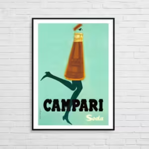
Without any unnecessary violence, these adverts seem somehow against the world. Nobody would say that advertisement is not an artform, but it becomes confused because they are selling something particular. Most artforms don’t know what they are selling, or what they will end up selling. I doubt this Campari Soda advert could’ve been drawn up without the advent of Surrealism. Two long running feminine legs come out the red bottle, shaped like a long red dress; the cap opens and there floating above the lid, a single eye. There’s no hiding the language the designer is using; they are declaring their alliance. Many artists designed adverts around this time, if not only to get the public to their exhibitions. A sort of taster before the real thing. This much is obvious: not every artist wanted the destitute life. And now these works are in galleries, in people’s homes; originals bought for high prices, whether they care for the brand or not. That lady standing on the shore of San Sebastian isn’t selling San Sebastian anymore. Is it because we cannot understand how that lonely aesthetic could sell anything anymore?
And why? I think the closest thing I’ve seen to the style, the general mood, of the old adverts has somehow found its way into cards. Cards for every occasion; birthdays, Christmas, etc., depending on for who. These cards are also, note, usually in independent cafes, or as a side note in some small art gallery. The minimalist aesthetic, which is a lonely aesthetic, seems to work well for a fleeting day; Edward Hopper could’ve made some good adverts in the old style. That should give some indication of what I mean by lonely. Although, the old adverts are different, still. Their loneliness is a strange one, like nostalgia, like a pleasant dream. You cannot enter these simple, block coloured worlds but you have a feeling you were once there, or things ought to be this way. Yes, I’m sure the Grand Prix would feel like that if I had ever been, as it is pictured in that impossible angle that I could never see. Perhaps it is a loneliness of being exiled to the real where these products are products and not ones we care for much of the time.

How successful then was the marketing campaign; even the adverts sell, and no one could possibly call these products second-rate. Nostalgia drives up the price and lets reproductions hang on the wall. A gallery in London, the Estorick, put on a Campari and Negroni retrospective a few years ago. The artform, which is readily happy to admit its ulterior motive, of advertising started here, started functioning as we know it does today. And at this time, it was particularly beautiful. With the TV, with the cinema, and the internet, adverts transformed, not necessarily for the worse but generally at a heightened frequency. Bombardment and annoyance. Muted. You watch what you want but your pleasure and attention is broken constantly etc. etc. and all that talk about subliminal messaging. Even with the standing ad, the painted ad, there is usually something needlessly provocative, non-sensical, stupid and ‘post-modern’. I suppose the ‘art’ of marketing grew in the previous century to make adverts more effective somehow. I haven’t looked into but what else would happen, money-makers tend toward an idea of optimisation. A scant look shows something like a strange trick where adverts try to talk like you might talk, think like you might think, produce scenes that you might live – might live, might live. Does this not produce some cognitive dissonance – no! I am not like that, I am not as simple as that advert makes me out to be, or, on the other hand, perhaps I am, perhaps I am that mystifying. It may be these will be nostalgic relics themselves in a hundred years, and a writer won’t really comprehend what they meant, or will try and riddle something out of them, or perhaps come to the conclusion that they aren’t worth the space on the wall.
==============
This Carl Kruse Blog Homepage is at https://carlkrue.at
Contact: carl AT carlkruse DOT com
Other articles by Fraser include: On Magical Thinking, and Matters of the Occult.
The blog’s last post was Is Rave Culture Dead?
Also find Carl Kruse on Threads and Carl Kruse on Dwell.
==============
This Carl Kruse Blog Homepage is at https://carlkrue.at
Contact: carl AT carlkruse DOT com
Other articles by Fraser include: On Magical Thinking, and Matters of the Occult.
The blog’s last post was Is Rave Culture Dead?
Also find Carl Kruse on Threads and Carl Kruse on Dwell.
