by Hazel Anna Rogers for this Carl Kruse Blog
I saw a black and white photo on the Instagram page of this website’s namesake, Carl Kruse. It was a photo from 1966 of an Olivetti storefront, all glass, typewriters displayed on delicate metal thrones, their backs to the windows, their keys ready to type. It’s such a quiet photo, pointed shadows leaking out from the light sunning the typewriter display, a neon sign standing lonesome up top, black shadow and a metal door barely perceptible on the left of the image. It looks like Nighthawks by Edward Hopper, only without the people, without the bar, without the streetlamps, and without New York. I knew someone once who had a reproduction of that painting. It was the only good thing in his house.
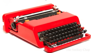
I had a typewriter when I was younger, and I very briefly fell into an obsession with writing on it. I think I handed in some homeworks for school that I had written on the thing. I wrote on it until the ink ribbon ran out, and then I never replaced it. It must still be sitting somewhere in my parent’s house. It was fun to write on. The innefacibility of it made me more consciencious about what I was writing. It’s not like now, where I’ve started and restarted this article a hundred times, and you wouldn’t even know, that’s the beauty of the computer, it’s easy to get rid of the dirt. And the typewriter made such a cacophony, too! Big clacking for each letter, even more for the stubborn ones, you had to put force into it, it was all deliberate. Ha.
I bought a typewriter for my good friend recently, for his birthday. We went to collect it somewhere in East London. We waited in the designated spot, right by some steps down into the metro, and a woman came and gave it to us in its hefty off-white travel case. It’s a really lovely thing, it is. My friend had been talking about typewriters, that’s why I bought it for him, and it wasn’t too dear either. He has worked on it a little, but he needs to replace the ink ribbon. Ha.
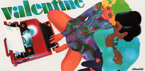
In an edition of V Magazine from 2002, Bowie spoke on his own typewriter, the Olivetti Valentine, sold in auction at Sotheby’s in London for no less than £45,000, plastic glossy red body, curved edges like Leo Johnson’s Corvette, delicious it is, bright as a traffic light, colour of the sunsets you only get in winter, big orange red. The Olivetti Valentine typewriter was designed by Austrian-Italian architect-designer Ettore Sottsass in 1969. And goodness ain’t it pretty, you gotta see this thing! Orange ribbon caps inspired by pop-artist Thomas K. Wesselmann’s nudes of the 60s and 70s, floating keys suspended in space, a neat rounded plastic case to carry her in, and that beautiful word, ‘Valentine’, etched in raised letter on the front, so you never forget her name. And, indeed, you couldn’t forget it if you tried, not when Brigitte Bardot was seen waltzing around with the thing, nor when Heathrow airport was graced with one held on the arm of Richard Burton, his wife Elizabeth Taylor on the other arm, nor while your eyes were smarting in shock at Stanley Kubrick’s ‘A Clockwork Orange’, watching protagonist Alex reclining on his bed, his own faithful, bloody Olivetti Valentine sitting patiently on his bedroom desk.
In the article, Bowie says that he typed up many of his lyrics on the Valentine, stating that its ‘pure gorgeousness’ compelled him to keep writing until his songs were done. He goes on to talk briefly about the Memphis Group, or Memphis Milano, Sottsass’ Italian design and architecture group, active for seven years from 1980.
“It didn’t look serious. It looked like a prank. […] Bright yellows against turquoise. Virus patterns on ceramics. It couldn’t care less about function. How do you sit on that? It tabled the idea of the idea. Each piece of furniture offered a plethora of possibilities, options and inconclusive open ends. It sucked on the breath of pop culture with gusto and an enthusiasm that was delightful to witness. Within a short time, the street was overflowing with cheap and nasty spin offs. Everyone thought they could knock off a Memphis line and did. Oh, the horror, the ridicule. Except that nothing ever looked the same again.”
And by golly, he’s right! We’re still smarting from it, still reeling from Sottsass’ big bomb of plastic colour. It’s all so useless, that’s what so good about it. All the ergonometry is gone, nothing in its right place, you’re bombarded by questions, nothing to do but stare at it, wonder what its doing here, wonder how anything could ever live up to it, it’s a breathing thing, it makes everything else seem pointless, might as well just have a room bare but for a chunky wooden Carlton and a gauche marble Agra, pointed at a television set, eating a perfectly round burger off of a Rucola plate, drinking orange juice out of an alienesque Deneb glass vase, watching Eraserhead by David Lynch, typing notes on the movie beside you for film class on your Olivetti Valentine. You’re in a spaceship, there are no windows, there’s only the white marble floor and the sound of your chewing and typing and on the TV the lady in the radiator is singing ‘In Heaven, everything is fine, you’ve got your good thing, and you’ve got mine!’
They’re like playthings, Ettore Sottsass’ works. They’re all so yummy, like plastic toy food and those carpets you had when you were little that had roads and countryside all over them, or like an old Miffy book, block colours, with a title like ‘Miffy is crying’ or ‘Miffy at the playground’. In 2012, in the San Francisco Chronicle, Bertrand Pelegrin called Sottsass’ work ‘a shotgun wedding between Bauhaus and Fisher-Price’. That’s just right. Of course, it wasn’t just Sottsass – there was a whole team of young people behind the Memphis Group. One of my favourite designs was thought up by French designer Martine Bedin, the ‘Super Lamp’, an object that was a part of her ‘friend-like’ designs. Its a car-esque thing on wheels with multicoloured little lamps sticking up out of its spine, which she said was ‘like a small dog I could carry with me’. Her ‘Terminus Lamp’, too, with its lovely round flamingo pink feet and long metal neck, is like an animal companion, well-suited to our aformentioned scenario involving watching Eraserhead with a burger and a vase of orange juice.
The Memphis Group’s designs, and our beloved Olivetti Valentine, feel playful, nostalgic, a beacon for the so-called ‘decade of decadence’, as has been dubbed the 1980s, with its MTV sparkling big songs and bigger dreams, its Royal Diana wedding with pudding dress to match, its ET calling for home, its space travel, its birth of internet. But then these designs also feel a world away from all that. They feels like a thing of their own, naive bystanders to all the terror, the Iraq war, the AIDS epidemic, Chernobyl, Challenger, the Falklands, the violence of Wall Street, the money, the money. These pieces, they’re like children, wide-eyed, copied but never the same, a reminder of all the world’s absurdity, nothing fitting together, nothing matching, chaos, beauty.
“It’s true that you can’t put another piece of furniture within the same space. There is just no aesthetic room. All networks of proposition are trammelled by this one item. Terrific. It’s a remix, rap, it’s hip-hop. Would all of the Starcks and Lovegroves of the world please stand and salute the greatest designer of the last fifty years? Your doors were opened by this man. Ettore Sottsass.” (David Bowie, 2002)
==================================
This Carl Kruse blog homepage is at https://carlkruse.at
Contact: carl AT carlkruse DOT com
Other articles by Hazel include Fired, Go Read A Book, and Sleep and the Enduring Insomniac.
Carl Kruse is also the Berlin Chair of the Princeton Alumni Association of Germany and director of the Ivy Circle.