
by Hazel Anna Rogers for this Carl Kruse Blog
I was bedridden with sickness for a week. Body of bricks, hanging on, sun tickling lace curtains, morning and day and night all the same.
I am coming back to life, now. These past few days, as I began to regain my good health, I set about reorganising my room. I have been here, in this house, for nearly five months. Only five months? Already five months? Strange. Time stretches and narrows. Anyhow – a few days ago, I set about reorganising my room.
I opened my grand old trunk, leather handles so old they’ve turned to breadcrumbs, and took out the pictures I had kept in there. Artworks cut from an out of date calendar. Paintings and pastel drawings by myself and my sister. The two haunting prints of etchings by Gustave Doré, illustrations from 1877 for the Samuel Coleridge Taylor poem The Rime of the Ancient Mariner. My best friend and I bought the prints in Brighton. I remember picking them out. One of them is his; the print with the sailor sitting on the edge of his ship, all of his crewmates dead, an enormous dead albatross hanging from his neck.
Beyond the shadow of the ship, I watched the water snakes.
And mine: a ship rocking atop a moonlit sea.
The moving moon went up the sky.
I put up two other works, both printed onto the back of a limited-edition newspaper that I bought in France last summer. Hot sun, cool river. One of the posters has a garishly red background, and a collection of objects featured in David Lynch’s series Twin Peaks. In the centre of the poster, the framed portrait of Laura Palmer as prom queen.
The other poster is a large film poster for David Lynch’s 2001 film, Mulholland Drive. The poster is a reproduction of a 2021 screen print by Krzysztof Domaradzki. It features actress Naomi Watts seated on a bed, her hands clasped about her knees, her face tear-stained. Out of the window, we see the hills, atop which is perched the Hollywood sign. All is orange and blue, high contrast. Naomi Watts is not looking out of the window.
It is a lonely picture. It is a marvellous picture. It brings to mind the urban landscapes of Edward Hopper. Even if, God forbid, you haven’t seen Mulholland Drive, this poster evokes a profundity of meaning that stretches into the film itself.
Mike Williams, in the May 2026 edition of Sight & Sound, asserts that movie posters are the ‘primary encounter’ that an audience has with a film, the first experience, the first story we recognise before sitting down in the movie theatre. The best film posters give us a narrative within themselves; Naomi Watts, choked with tears, alone in a room in the most oneiric city on earth. Why is she crying? Whose blue stetson rests on the floor beside the bed? Who is the shadowy woman captured in pale yellow on the wall behind Watts’ lonesome body?
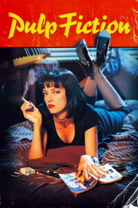
In my room in halls at the University of Leeds, I had a poster of Uma Thurman in Pulp Fiction by Quentin Tarantino. The poster, featuring a photograph of Thurman by Firooz Zahedi, was released in 1994, after the film won Best Picture at Cannes. It looks like the cover of a magazine, Rolling Stone loudness, or the cover of a sleazy crime thriller from the mid-century, a 10c sticker atop the banner of writing crowning Thurman’s nonchalant pose. Thurman has a hand pressed onto a written copy of Pulp Fiction, a reference to Tarantino’s influence of hard-boiled crime fiction from the 50s and 60s. It’s cool, a cool poster, cramped and dirty and slick, just like the film itself. We go in to watch Pulp Fiction, having already feeling like we’ve read the book; girls, guns, cigarettes, and gangsters.
I spoke with my mother on the phone yesterday, and told her I was writing an article about movie posters. She and my father were going out for the evening, and she asked me how she should do her hair. I said a high ponytail. As she fixed her hair, she told me that when she was younger, and would go to visit her father at the weekends, she’d ask him to bring her to the movie theatre, then come to collect her in the evening, and she’d spend the day watching film after film after film.
When she left the theatre, she’d take with her posters from the films she’d watched. She recalled a particular poster she’d held onto, long after her teenage weekends whiled away in the dark before the screen. It was a poster from Harlequin, the 1980 fantasy thriller by Simon Wincer, starring the dashing Robert Powell and a bug-eyed David Hemmings. Something in the film had touched something deep inside of her. She wasn’t quite sure why. I haven’t been able to locate the poster she remembered; an image of Powell’s eye, all made up, staring out of the paper. She was 13 at the time. Funny how these things stay with you.
Film posters have the ability to renew their significance after one watches the film the poster is associated with. A detail in the image, such as the aforementioned shadowy woman gazing out from the yellow wall in my poster of Mulholland Drive, suddenly mean something to us that they might not have done before. A poster then becomes an aftertaste of a film, bitter or honey sweet, memorable or rinsed out sharpish with toothpaste, or whisky.
Film posters started being manufactured in the 1890s when French artist Jules Cheret began using lithography to produce detailed prints. Posters at this time were mostly used functionally, to display screening times and locations where the films were being screened.
In 1895, Marcellin Auzolle produced the first inception of the film posters we know today; a colourful depiction of a lively audience regaling in watching a projection of L’Arroseur Arrose, one of ten films being screened for the public by the Lumiere Brothers in Paris, December 28th, at the Grand Cafe. From then on, film posters continued to proliferate throughout the film industry, oftentimes echoing the artistic sentiments or movements of the time.
In Germany during the 1920s, the Expressionist movement was at its height, a movement that was ‘based essentially on an elemental artistic urge to overturn and oppose…[in order to create] a particularly overwhelming effect’ (Prof. Dr. Herbert Beck, Foreword, The Total Artwork in Expressionism) as a reaction to the rapidity of industrialisation and urbanisation, and the crippling effects of World War I on society at large. The movement is perhaps most greatly understood by considering this quote from a letter written by author Franz Kafka to Oscar Pollak in 1904: ‘
I think one should, in any case, only read books that bite and sting. If the book you’re reading doesn’t wake you up like a slap in the face, why read it?
(The Total Artwork in Expressionism, pp. 14)
Das Cabinet des Dr. Caligari, the first Expressionist film, directed by Robert Wiene in 1920, resulted in numerous collaborations with visual artists to produce posters that both responded to the film and to the pronounced artistic sentiment of the time.
One of the posters, a lithograph by Otto Arpke and Erich Ludwig Stahl, depicts a disturbing image of a warped room, all jagged edges and elongated furniture, lit solely by a crooked candle standing upon an equally crooked desk. In this poster, we encounter the overarching themes of the film: claustropobia, both external and internal; anxiety relating to the war and the tyranny of the Weimar Republic; and the instability of the mind, which, as in the case of the somnambulist in the film, results in it being easily manipulated by authority.
In the 1960s and 70s, photography began to overtake handpainted film posters. John Schlesinger’s New York City drama, Midnight Cowboy (1969), spearheaded the transition with its gritty minimalistic poster, featuring a dirtied-down Dustin Hoffman and an anxious-looking Jon Voigt. The two are standing on a street corner, and the building behind Voigt is scratched and brittle. There is a pile of detritus beside Voigt’s feet, and a metal pillar half-obscures Hoffman.
The poster is a far cry from the burlesque of the posters preceding it, notably posters such as that for Billy Wilder’s grimly comic noir, Sunset Boulevard (1950), a parade of violent red, the contorted face of villain Norma Desmond, then Joe Gillis and Betty Schaefer, locked in fierce embrace. Or then the whimsical print by Pierre Etaix for Jacques Tati’s farce Mon Oncle (1958), which depicts a cartoonish illustration of two white and grey figures: a boy grinning up at a man, a black dog in the corner, vivid red, childhood. The poster harkens to the playful, farcical narrative of the film, and stylistically, if not materially, is in keeping with the pop-art tendencies of the nouveau realisme movement of the time.
The Midnight Cowboy poster spoke to something different; a new cinema, which had dropped the facade of the Hollywood studio machine, and was leaning into something more real, more ‘human’. Black and white, dirty faces, street corners, empty pockets, sound of the subway, sound of the gun. Gone were the starlets.
From then on, photographic posters took over in a big way. Images like that of Marlon Brando as The Godfather, or Tim Robbins with his arms outstretched in the pouring rain for Shawshank Redemption; these images remain etched over our collective cultural consciousness.
But painted/handmade posters also continued to capture audiences during this time, notably the posters of Philip Castle, a pioneer in the use of airbrushing, who collaborated extensively with director Stanley Kubrick.
Castle’s poster for Full Metal Jacket (1987) – a helmet lined with a ring of bullets atop a white background, a peace insignia beside an inscription of the words BORN TO KILL. It’s a perfect poster, inhuman and grostesque, representing the ‘duality of man’ (Mike Williams, Sigh and Sound), and standing detached from the film, an echo of the themes of the movie, a stamp on the dirty trail of history. Then, we have Castle’s equally disturbing poster for A Clockwork Orange (1971); a featureless face in a bowler hat before a bright orange background, with merely a wide, bulging stylised eye – almost cog-like in shape – peering out at us.
This ‘eye’ is a reference to the significance of the eye in the narrative of the story; protagonist Alex’ ‘evil eye’, but also the torture he is subjected to at the end of the film, where his eyes are pinned open as he is forced to endure a screening of such terrible images that – in conjunction with the nausea-inducing drug in his system during the screening – he is left unable to commit the crimes he previously found inestimable pleasure in. The genius of the poster lies in its allusion to the viewer being in collusion with the actions of Kubrick’s protagonist, Alex: we, as ‘the eye’, watch him commit attrocities for entertainment.
Of late, we have seen a renewed interest, a ‘renaissance’ of sorts, in the art of the film poster. There seems to be a greater inclination towards surrealism, or even mathematical paradoxes and trompe l’oeils, in the style of M. C. Escher – representations of microcosmic worlds of burden, terror, and confusion. This echoes the artistic sentiments of our own time, characterised by a lack of a central ‘movement’, an artistic chaos defined by our age of the internet which ever influences our tastes, our styles, and provides us with the capability to share art further than ever before.
New posters have also leaned on our desperate sense of nostalgia as promotional material; one poster for Alex Scharfman’s Death of a Unicorn evokes the posters of 80s fantasy films such as Labyrinth and The Dark Crystal, despite the film itself not at all harkening to the pomp and puppetry of these features. The poster, designed by Tony Stella, speaks to nostalgia to sell a fairytale for the new age, a fairytale complete with CGI accompanying puppetry to produce the monstrous unicorn of the title.
New posters, particularly hand-painted or graphically-designed offerings, feel chaotic, uncertain, and deeply contextually linked to this age of information. Easter eggs in the corners; inspirations galore; 1960s, 1980s, 2050s, ages gone, ages to come; beautiful, beautiful mess. This is the time we live in; messy, uncoordinated, colourful, cold. It’s all moving so fast. It’s breakneck out there.
Long live the movie poster.
==============
The homepage for this Carl Kruse Blog is at https://carlkruse.at
Contact: carl AT carlkruse DOT com
Other articles by Hazel include: Our Obsession With The Lives Of Others, The Art of Well-Dressed People, and Film Scenes I Wish I Had Never Seen.
Also find Carl Kruse on Stage32.
